By Caroline Fahmy, President and CEO
Since our company’s inception, our Planware division has used geographic information systems (GIS) to view data. Our GIS software applications and services have helped map school district boundaries and model changes in school attendance areas. Using maps to model changes in the district’s geography (e.g., new streets or subdivisions) or student population (e.g., growth or decline in one or more areas of the district) assists school district planners in making decisions about how to utilize their school facilities more efficiently and, ultimately, better meet students’ needs.
GIS is a logical way of approaching facilities planning data because it is generally geography based, but GIS applications can be used for more than facilities planning. GIS can be used to map just about any type of data that is geography based. The question is—why would we do that? Why map data for reasons other than simply to make pretty maps?[i]
Going that extra step of mapping data must make business sense and serve a purpose. In education that purpose is to improve student learning and success. From a business aspect, we hope it would also save money or time—or, even better, it would help us solve more problems, make better decisions, and reach more students.
We all are aware that there is too much data. In fact, we have pretty much universally dropped using the word datum because there is never just one piece of data! So, making good use of our data has become a new challenge and the new goal. What is it about mapping data that is better than simply looking at and analyzing data in tabular form?
We have set out to answer that question.
“What may be more useful for educators is to bring data into the classroom not as data, but as ideas and solutions to teachers’ individual problems and questions—interpreting the data and helping it tell a story.”
— EdTech Digest, May 15, 2018
When I wrote in this article about what might help teachers in the classroom better understand and use data, it occurred to me that not everyone can or wants to use data. The dilemma is that we know data contains all sorts of potential, but it can be overwhelming to decipher.
All kinds of stories, important stories, are embedded in our data, and we should figure out good ways of extracting those stories. If we can bring data to teachers, school staff, and district leaders as stories rather than data, it could shortcut the process of making better decisions and arriving at solutions.
Mapped data helps to tell a story.
By mapping data, we can visualize it and better “see” the story that’s waiting to be told.
Stephen Gervais, Program Specialist at the San Bernardino City Unified School District (SBCUSD), has done extensive geospatial analysis to help tell stories about what is happening in his district.
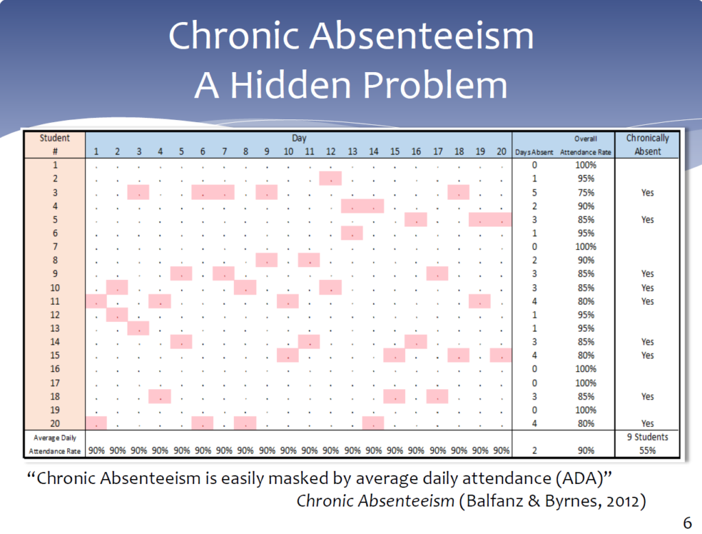
In his presentation titled “Trends in SBCUSD Chronic Absenteeism Data,” given to an SBCUSD audience, Stephen presents data related to chronic absenteeism in his district both aspatially (in tables) and spatially (on maps).
He first defined chronic absenteeism and then gathered the data, geocoded student records (i.e., assigned latitude and longitude values to each student based on his or her address), and, after breaking up the district into study areas, did various statistical and geospatial analyses.
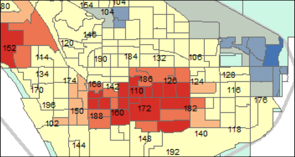
By mapping his data and looking at it spatially, he discovered there were concentrations of chronically absent students in two geographical areas.
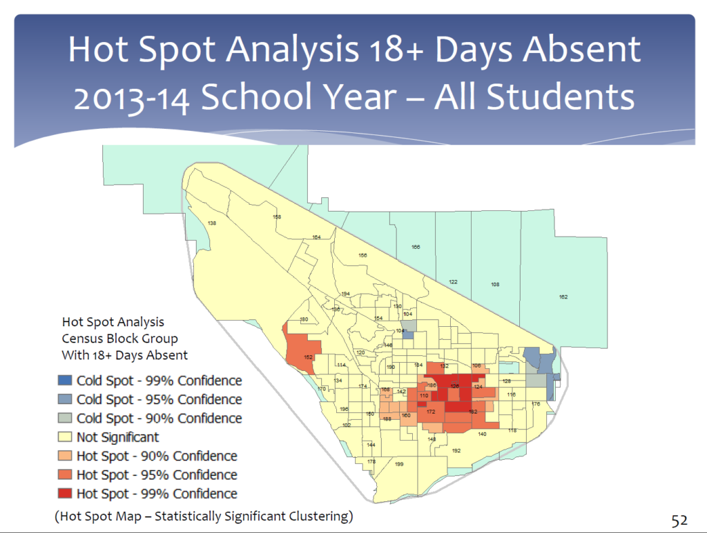
Patterns, relationships, or concentrations in the data—the story—are not always evident in tables of data. Data laid across the map of the district can tell the story visually. And, by knowing where, we can focus on who—who needs help and who will supply it.
Mapped data helps us draw conclusions.
We can see in Stephen’s presentation, for example, that two areas of the district are especially high in chronic absenteeism (the orange and red areas). Stephen identified these hot spots and was able to dig deeper into the data to identify subgroups of students in those areas that made up a large portion of those chronically absent; and then he dug deeper to identify specific students with specific issues.
Deciding who should reach out and provide support for students identified in hot-spot areas may require some additional examination. For example, the data, as shown in a hot-spot analysis, probably won’t follow specific school attendance zones because the data dictates the “zones.” Therefore, multiple schools or other agencies may need to be involved and collaborate in outreach steps.
Mapped data helps us plan solutions or interventions.
Once we know who, we can develop solutions or interventions. We can make a list of the students and families in targeted areas. We can attempt to learn why these students are, for example, absent so much—are there environmental or social factors at play?—and then design an outreach program tailored to them, their parents, and their communities. We can put extra time into communicating with the families in those communities and provide additional resources. We can set up new facilities or programs in the area that help to support our efforts. This is when the data becomes its most powerful.
Mapped data helps us make better decisions.
By understanding the story, we can work at making better decisions for how to impact student learning. For example, if areas of the district have shown problems over the years, in the long term, educators—perhaps working with the city, county, or local businesses—may be able to address the root of the problem and come up with a solution. However, in the short term, as students come into schools from those areas, educators may be able to anticipate particular struggles and put measures in place to help students enrolling in the district.
Additional steps can be taken: Leaders can develop goals based on the stories being told by the data. Spatial data can be used to help predict data into the future, which also may help with developing longer-term policies or decisions. Over time, it may be helpful to gather more data—look at trends and perhaps do a pre- and post-study—to see if efforts might be working.
To summarize the process:
- Collect data
- Map it
- Visualize it, study it, understand it—let it tell its story
- Draw conclusions
- Plan interventions or solutions
- Make decisions; automate or systematize decisions (e.g., develop algorithms, goals, policies, etc.)
- Follow up and collect more data
- Remap the data to see comparisons over time; help evaluate the effect of efforts
By following this process of using mapped data, we can visualize the embedded stories and have the opportunity to help more students succeed!
[i] For some amazing maps, see: http://www.esri.com/products/maps-we-love